Erin Kunkel Lettermark
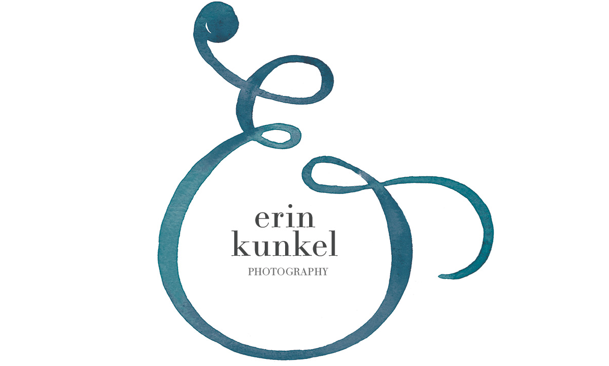
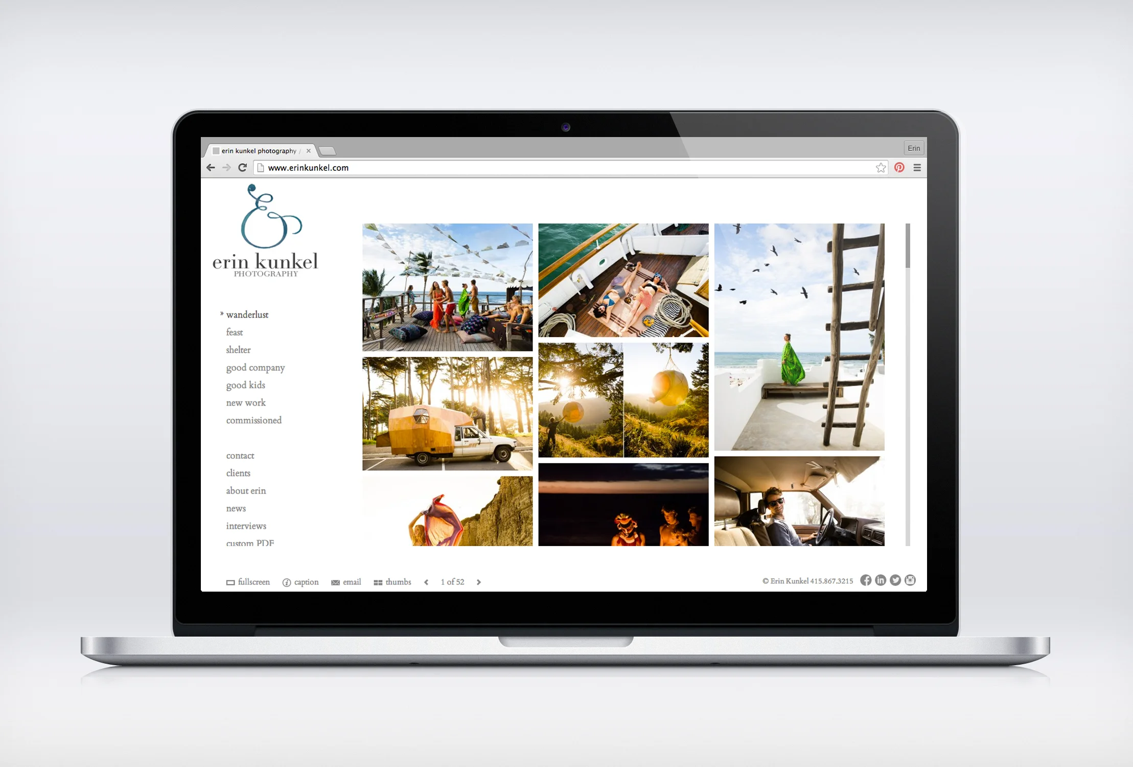
I had another chance to work with with George at McCalman Co. on this lettermark for Photographer Erin Kunkel's new brand. We did a take on an ampersand, turning it into a bold and curly script E. George's design nestles the logotype neatly in the belly of the letter, lending a human note to the crisp logo.
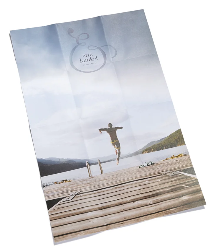
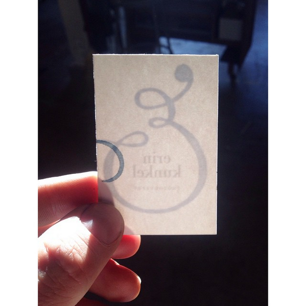
The logo/mark combo was also applied to all branding materials including her website, foldout poster, and business cards which were letterpress printed with a halftone and subtle split fountain to fashionably mimic the watercolor texture.
Art Direction + Design: George McCalman
Client: Erin Kunkel Photography
Photo: McCalman Co
Photo: @McCalmanco, Printing: The Aesthetic Union
