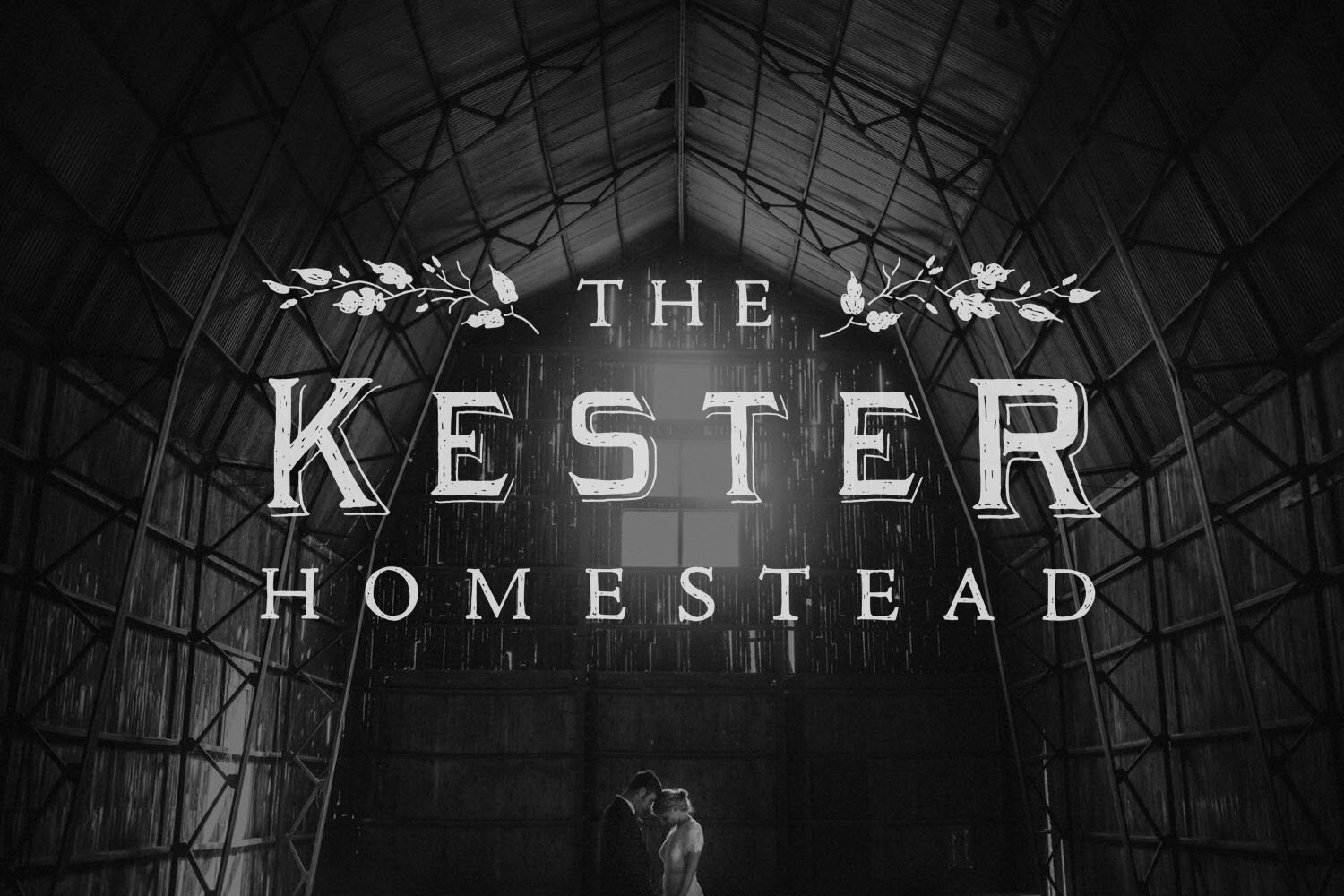
The Kester Homestead
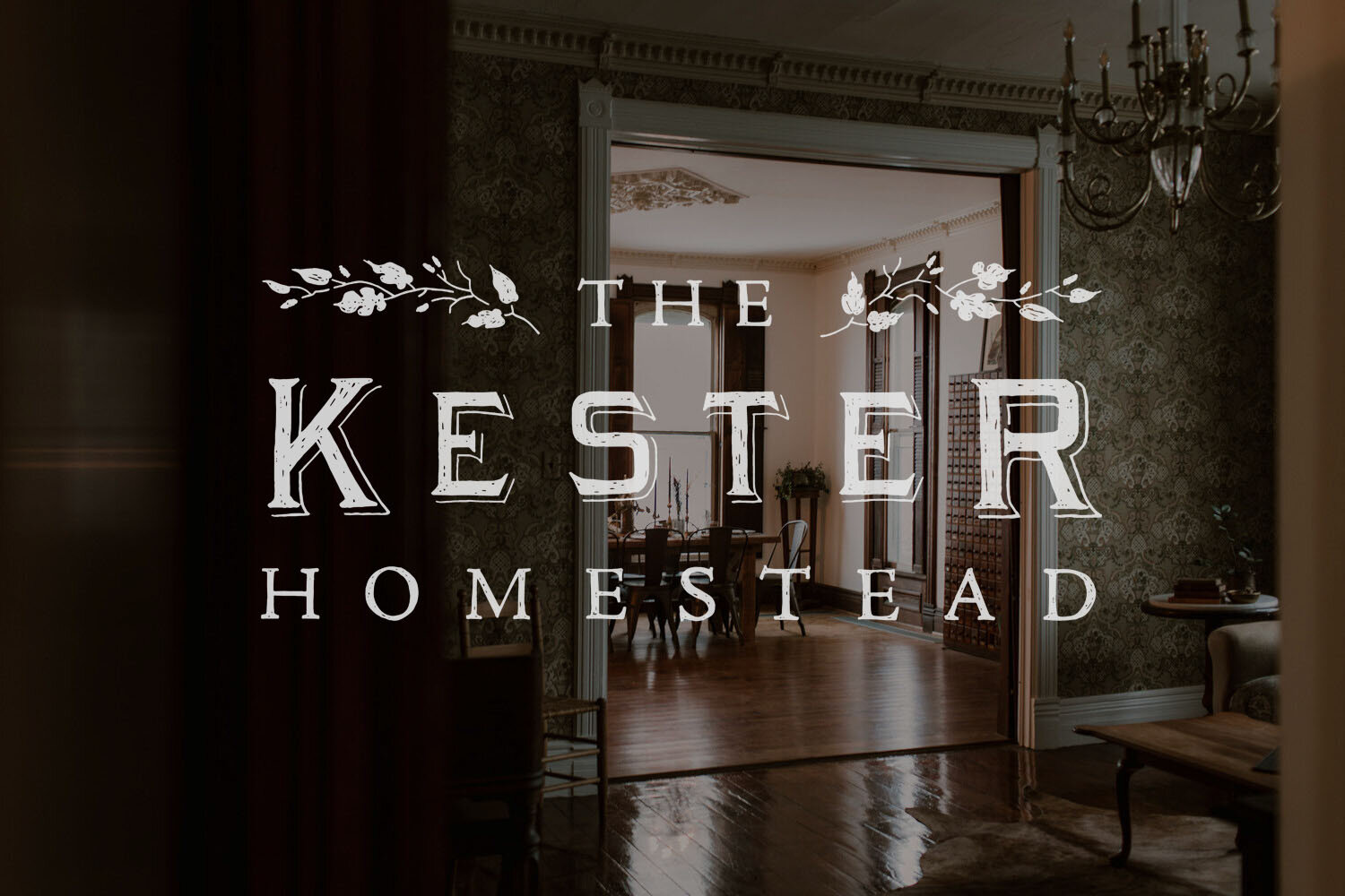
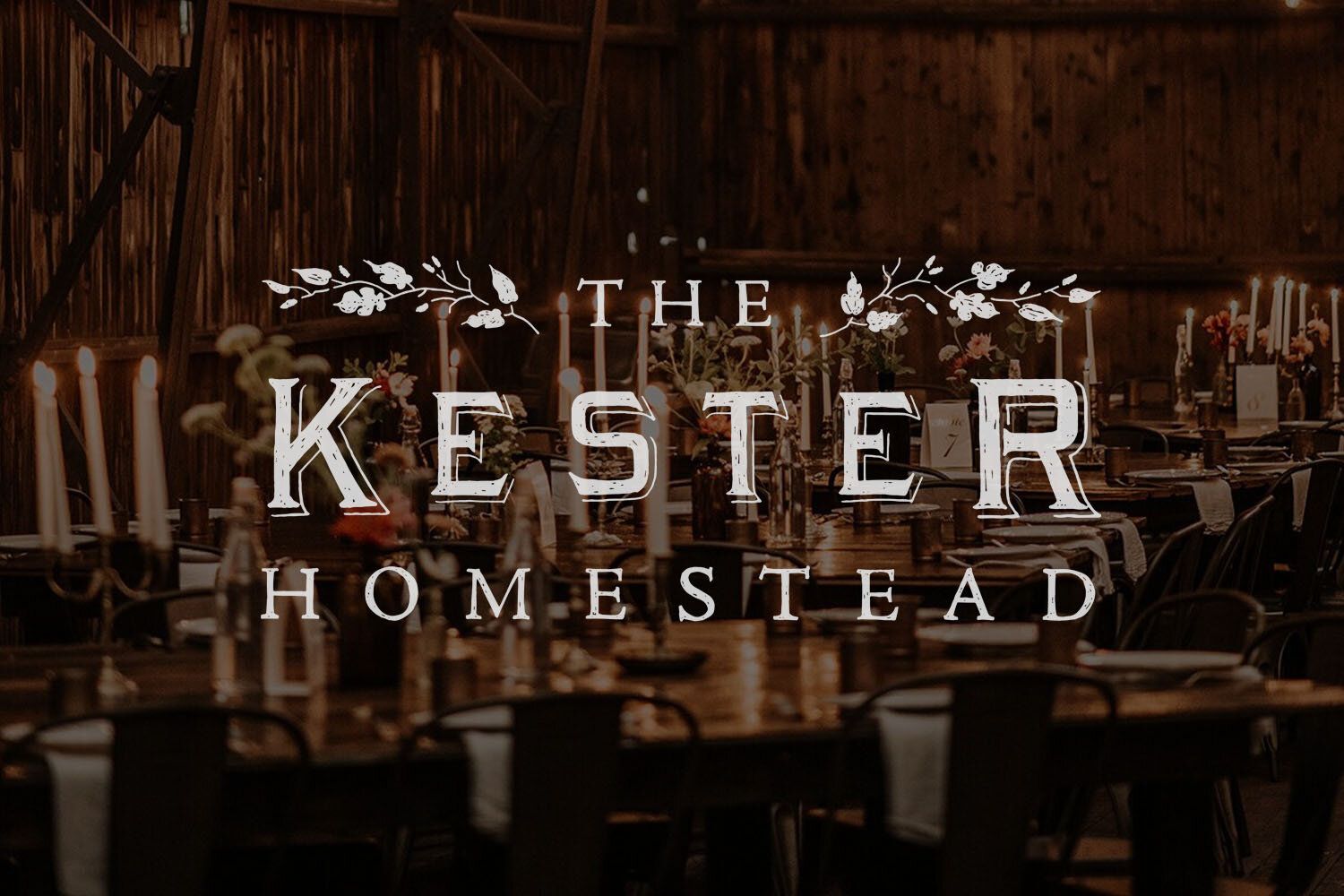
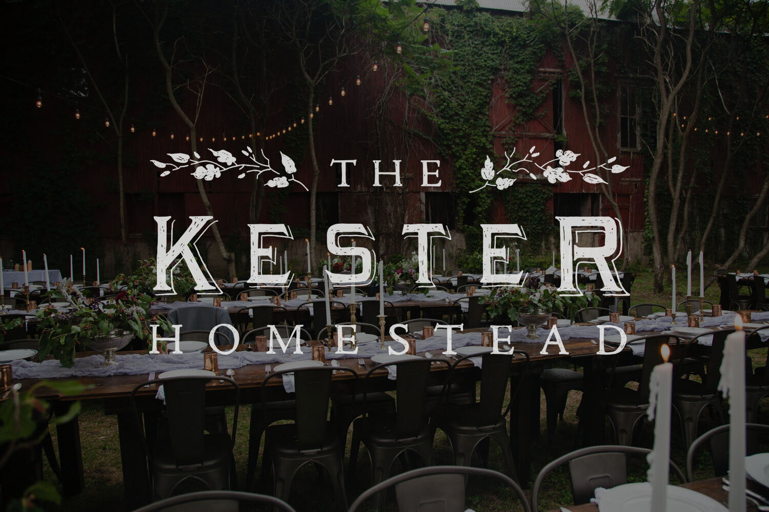
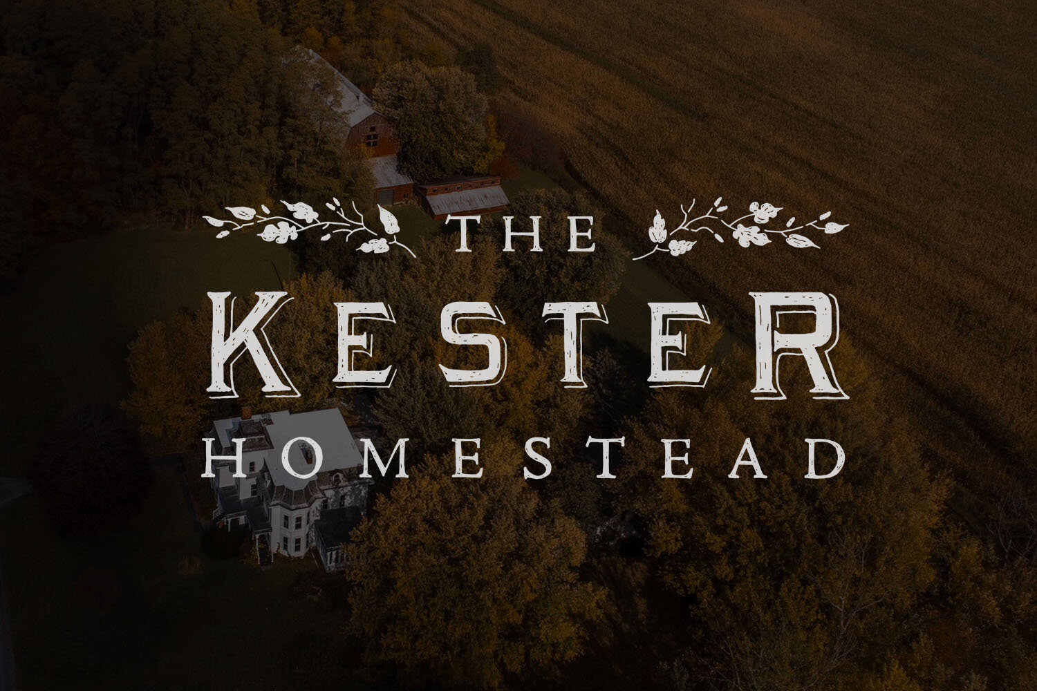
The Kester Homestead is a stunningly kept and curated event venue on an 1860s Farmstead, located in the Finger Lakes region of upstate New York. Mackenzie and Blaine Vossler are also responsible for the nearby shop and sister company The Local Branch, for which I made the logo many years ago. In 2020 they approached me to create an official brand for their already-established venue. One that was polished, yet remained congruous with The Local Branch’s textural, old timey Americana-style branding. To create that continuity, I used the same tools and materials to create this new mark, along with Victorian-era reference material, drawing from the time period when the house was built, in 1854.
I drew the “Kester” lettering from a 19th century metal type specimen of the decorative typeface Arboret, making some of my own edits. The company uses Caslon for all text on their website and existing brand materials, so the logo needed to mesh well alongside that typeface. The proportions weren’t quite right in this layout to use Caslon as subtext, so “the” and “homestead” is my rough pencil take on the always-nice Adobe Jenson.
The property of the venue is lush with mulberry trees, and Mackenzie requested to incorporate this element into the logo. And so the botanical ornaments that flank either side of this mark have been created to represent the mulberry trees. Using 19th Century metal type ornaments as reference, I customized the shape and pattern as a tribute to this special feature of their space.
I cannot wait to see this logo on the wooden roadside signage for the venue, one of many projects to hopefully happen post-Covid.
Photos courtesy of The Kester Homestead.

